Client Brief
GYEM asked us to create a campaign that would help send awareness to the youth population concerning the importance of health and the reality of the food they are eating. They asked us as designers to come up with a design solution. The targeted audience were the youth in Dubai. The campaign holds four main quarters, which are:
1) How the food we eat affects our future and our planet.
2) Debunking food myths and balanced diets.
3) Food in schools.
4) Exercise.
Project Brief
We provided the client with solutions that will help them in raising awareness about the importance of health and food. Our quarter revolved around exercise. As a design team, we were asked to create the branding part of the campaign and develop a creative way to grab attention by integrating fun and extraordinary ideas to present exercise. Team Pause decided to go with photography and videography as a design direction since it expresses more action and movement. The emotions that are presented through still images reflected what our idea was all about, fun and exercise, and the only way to prove it is fun is by showing it. We wanted the audience to be engaged further so we suggested few activites or events that help keeping the campaign alive. For instance, the flashmob as an introduction to the campaign, and a fitness calendar to help with time management and carry on with the purpose of
the campaign.
For our final graphic design project, we worked with GYEM to brand and create a campaign for a topic that is related to health and food. The class was broken down into four groups, each group worked on a specific quarter. Our quarter was about Exercise. At the beginning, our team leader, Fatima Alhashemi, asked each girl in the group to think of a theme (including name, concept, tagline..etc.) in general. I was able to come up with the name “Run For Your Life”, and with the help of Fatima, we were able to come up with a short brief, concept, and inspiration:
Run for your life
“ Its not all about weight”
Brief:
“Run for your life” is a campaign that suggest a better life, instead of focusing and measuring their weight, people
should focus on fitness and being healthy, you wont be healthier if your skinny, so run for your life not your weight.
Concept:
Its obvious that life is all we got, and we are responsible for it, who said skinny means healthy? That’s what we’re
trying to change.
Inspiration:
Few things that got us excited to run and also inspired us and might inspire you guys
However, our other team member, Amel, was able to come up with a more interesting idea. The campaign is called Pause. The name was inspired by Pitbull’s song called Pause, and the video is actually a zumba dance video.
Other responsibilities:
– Helped teammates with the typography in the announcements.
– Final retouches in the announcements to make sure all the elements and the typography are consistent throughout them all.
– Found a model for the female version of the poster.
– Helped photoshooting female model.
– Gave moral support to teammates when they needed it
– Suggested the idea of people taking a pledge to start exercise more often.
I was given the branding part of the project. I first started with the idea of the pause sign stamped on our fingers. I immediately started with illustrator without sketching the idea first. I also experimented with a few different typographic logo variations.
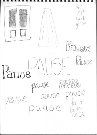
However, the logo was very weak like it was and it did not translate the strength and message we wanted to send with a campaign about exercise. So, I started reseaching for inspirational logos, and then started sketching out as much as I could.
Sketches:
Inspirational Logos:
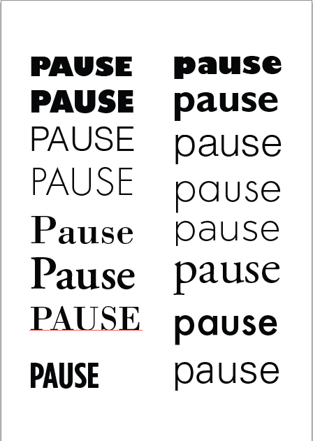
Typographic Variations:
I tried experimenting with several typographic explorations with both serif and sans serif typefaces to see which typeface looks stronger. I decided to go with Futura. Since it’s a sans serif typeface, I think it looks neutral and strong for an exercise campaigns.
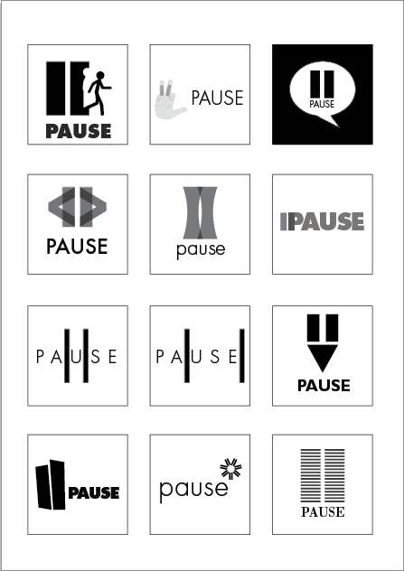
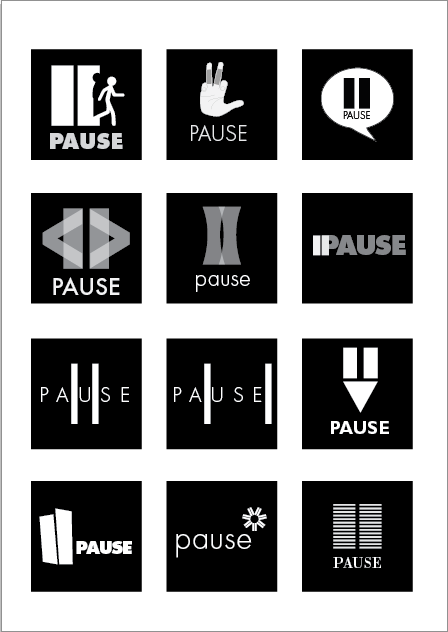
Black and White Logo Variations:
I took the sketches I made and transferred them to Adobe Illustrator. I put all the logos on both a light background and a dark background to experiment what looks better.
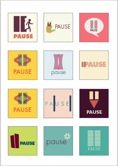
Colored Logo Variations:
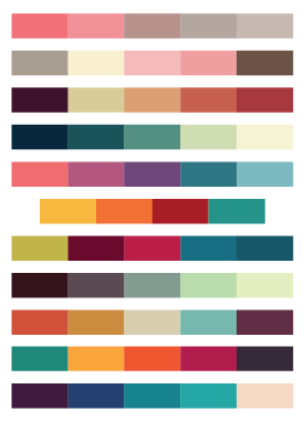
Color Palettes:
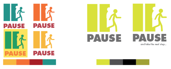
I experimented the logos using the following color palettes. I chose those specific color palettes because I wanted colors that were energetic and vibrant, and something that could really represent a campaign about exercise.
Final Logo Variations:
After experimenting with several different color palettes, and after asking teammates for feedback, we thought that choosing a very vibrant and energetic color palette would reflect movement and energy and exercising. However, because we later decided to go with the photography direction, we changed the color palette to more subtle, but still energetic, colors that are fresh and clean.
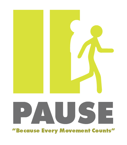
Final Logo:


